What is anatomy of typeface?
Just like how we have eyes, ears, nose, arms and legs that construct a human body similarly there are certain parts of a character that contributes to the overall shape of a character and also helps in defining the overall personality of a typeface. While memorizing these terms is a start, applying them to create professional layouts is a skill we focus on heavily in all of our Professional Design Courses.
By learning anatomy of typeface as a designer we will be able to know the intricate differences between different typeface categories and understand typeface classifications better.
Mastering this level of detail allows designers to choose the perfect font for branding projects. This technical precision is a core component of the typography module in our Graphic and UI/UX Design Certification Program.
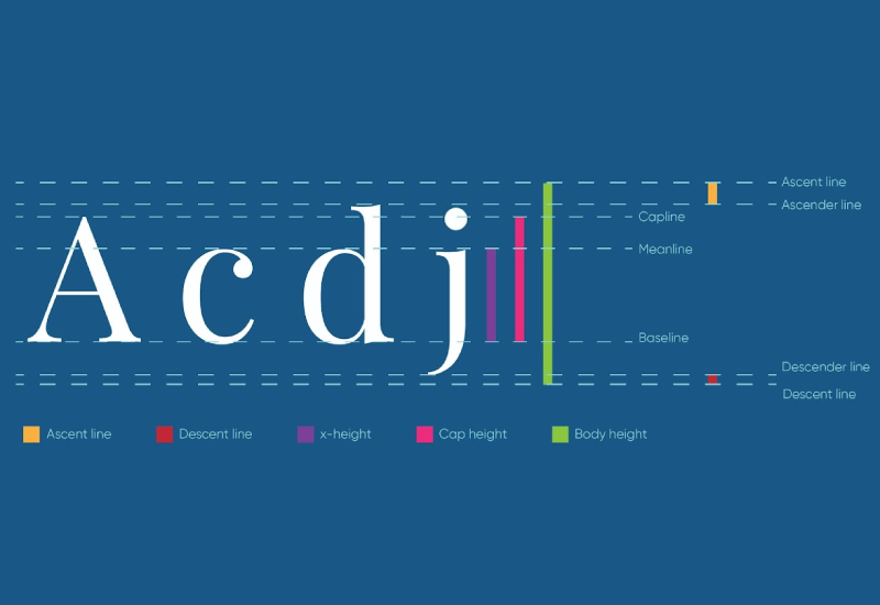
Baseline - The line on which a character stands, sits or hangs is called as baseline.
Capline - The line on the top of uppercase characters and some standing lowercase characters such as f, l and d is called as capline.
Meanline - The line on the top of sitting and hanging lowecase characters such as c, x, g and y is called as meanline.
Descender line - The line at the bottom of hanging lowercase characters such as j, g and y is called as descender line.
Descender - Any part of a character that falls below the baseline is called as descender.
Ascender line - The line on the top of the some uppercase and standing lowercase letters that exceed above capline is called as ascender line.
Descent line - The line that comes at the bottom of the invisible space after the descender line is called as descent line.
Ascent line - The line that comes at the top of the invisible space above the ascender line is called as ascent line.
Cap height - The distance between the baseline and the capline is called as cap height.
x-height - The distance between the baseline and the meanline is called as x-height.
Body height - The distance between the descent line and the ascent line is called as body height.
In digital environments, choosing between a Serif and Sans Serif is about more than just style—it’s about accessibility and user fatigue. We explore these psychological impacts in-depth in our UI/UX Design Course.
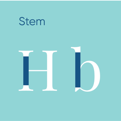
Stem - The vertical line from which rest of the parts of a character branches out is called as stem.
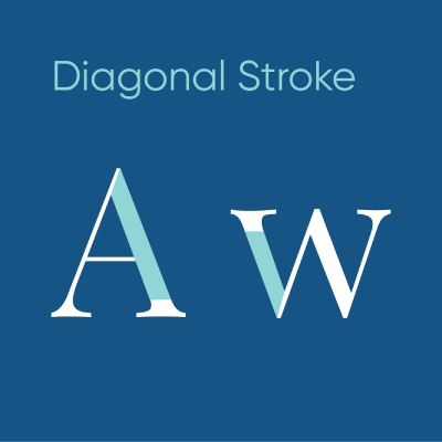
Diagonal Stroke - In the above image your eyes moved from left to right because the distance between the points kept decreasing as we moved towards right. This is how we use points to re-direct viewer's attention.
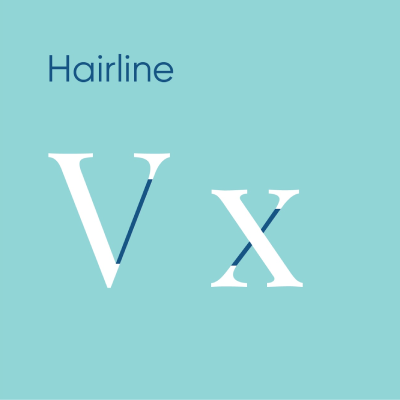
Hairline - The thinner line among the two main strokes is called as hairline. They are majorly found in Serif typefaces.
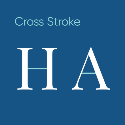
Cross Stroke - The horizontal line connecting between two stems of a character is called as cross stroke.
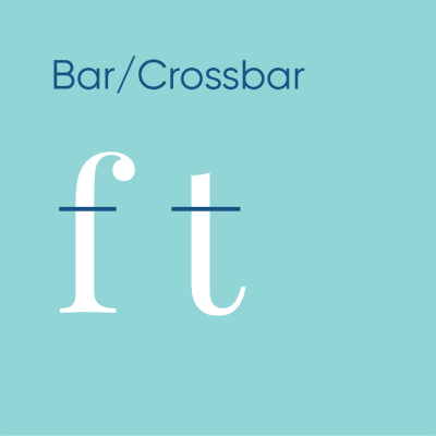
Bar/Crossbar - The horizontal line that crosses or branches out from the stem of a character that does not connects to another stem or is open ended is called as bar or crossbar.
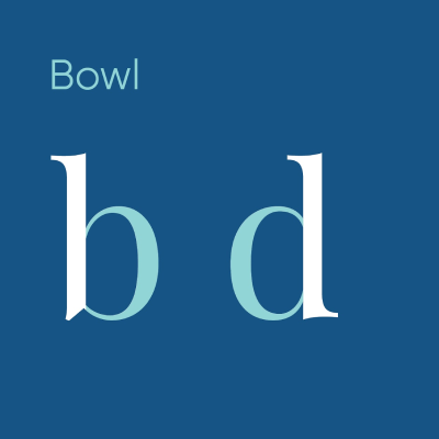
Bowl - The curved line that branches out from a stem that forms an enclosed or open space is called as bowl.
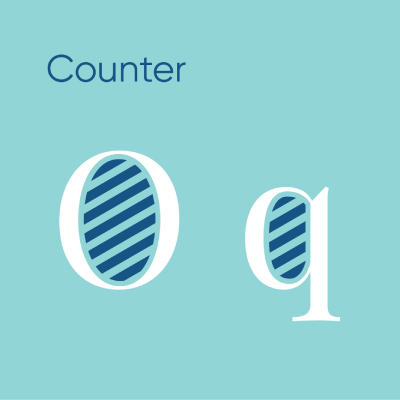
Counter - The enclosed space created by a bowl is called as counter.
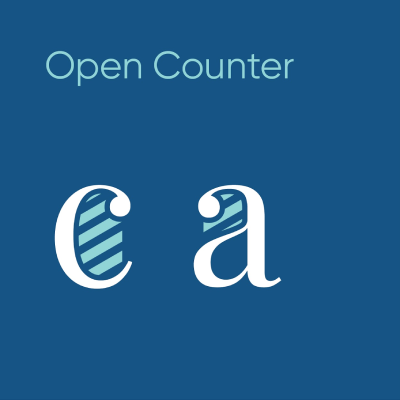
Open counter - The open space created by a bowl is called as open counter.
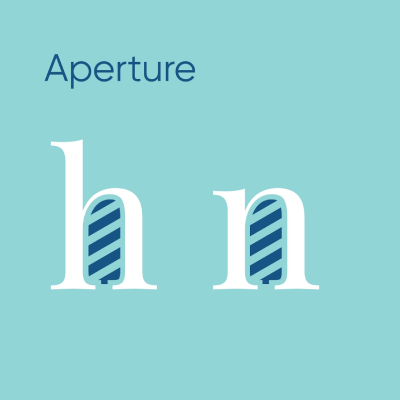
Aperture - If the open counter is opened upwards or downwards then it is called as aperture.
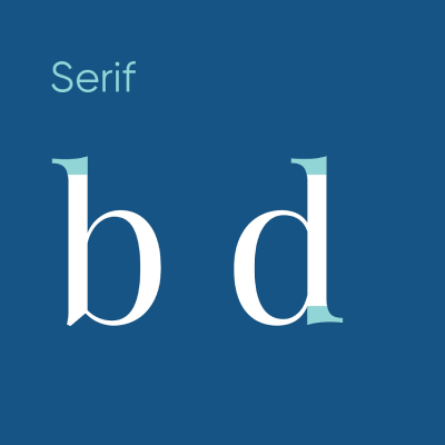
Serif - The decorative projection at the end present in some typefaces is called as Serif.
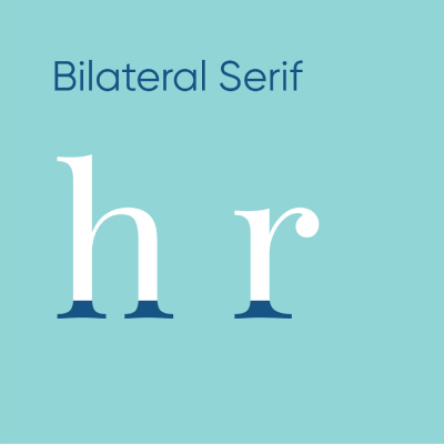
Bilateral Serif - If serif is going to extend symmetrically on both the sides of the stem then it is called as bilateral serif.
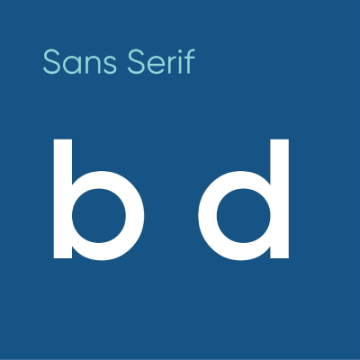
Sans Serif - Typefaces that have flat ends without any decorative piece at their ends are called as Sans Serif.
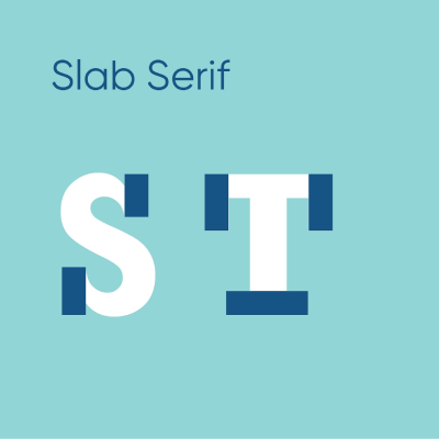
Slab Serif - If the Serif does not tapers towards the end and has equal thickness of the stem or stroke then it is called Slab Serif.
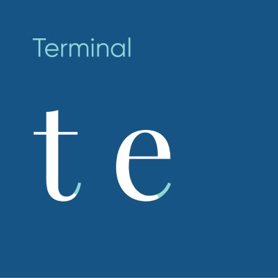
Terminal - The curved tapering end without any serif in some lowercase characters like t and e is called as terminal.
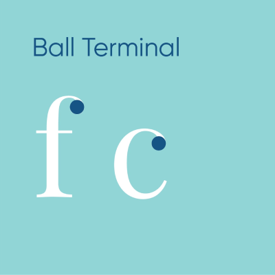
Ball Terminal - The rounded end of serifs in some lowercase characters such as f and c is called as ball terminal.
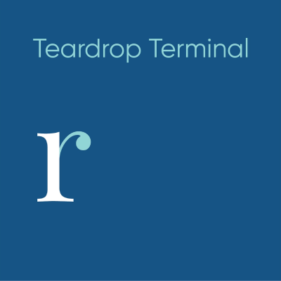
Teardrop Terminal - The teardrop shaped end of serifs in some lowercase characters such as r is called as teardrop terminal.
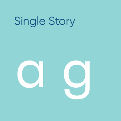
Single Story Characters - If the characters has only one counter then it is called as single story characters.
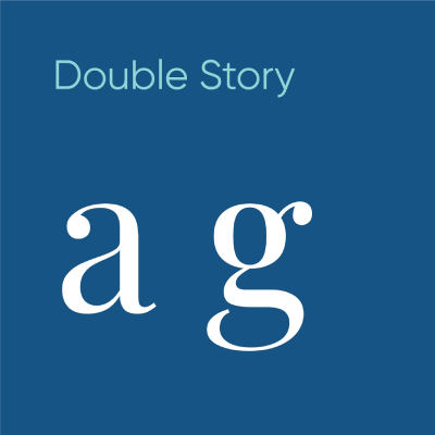
Double Story Characters - If the characters has two counters then it is called as double story characters.
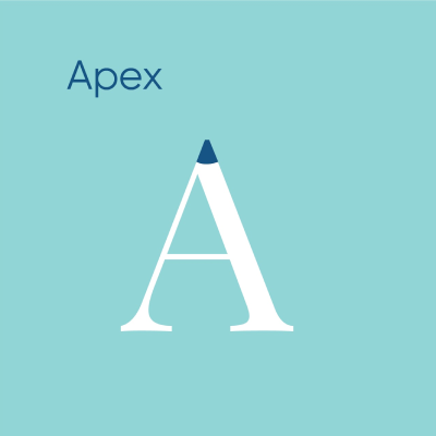
Apex - The pointed end at the top of a character where two strokes meet is called as apex.
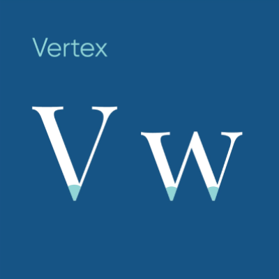
Vertex - The pointed end at the bottom of a character where two strokes meet is called as vertex.
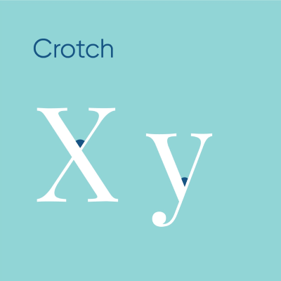
Crotch - The angle between a vertex is called as Crotch.
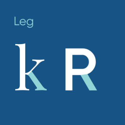
Leg - The diagonal stroke traveling downwards that extends from a stem or bowl is called as leg.
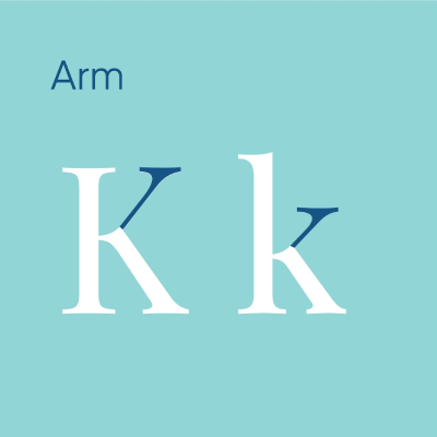
Arm - The diagonal stroke traveling upwards that extends from a stem is called as leg.
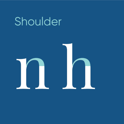
Shoulder - The curved stroke traveling upwards and then travels downwards, extending from a stem is called as shoulder.
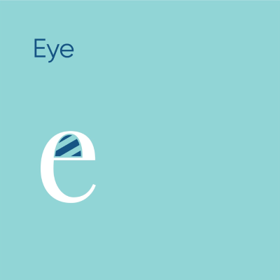
Eye - The counter in the lowercase character e is called as eye.
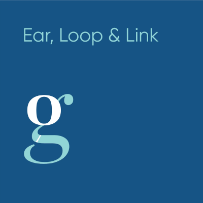
Ear -
The teardrop terminal extending from the bowl of lowercase double story g is called as ear.
Loop -
The second bowl in the lower deck of lowercase double story g is called as loop.
Link -
The curved part connecting between the bowl in upper deck and the bowl in lowerdeck in lowercase double story g is called as link.
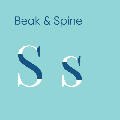
Beak -
The sharp asymmetrical bilateral serif at the end of some characters such as s and z is called as beak.
Spine -
The double sided curved part in both uppercase and lowercase S is called as spine.
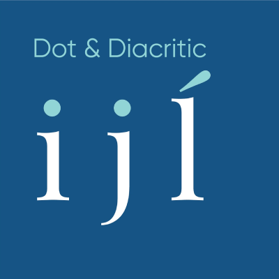
Dot -
The circular piece floating above lowercase characters i and j is called as dot.
Diacritic -
An irregular mark floating above a character is called as diacritic.
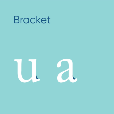
Bracket - The small angular enclosure created only in serif typefaces where the serif moves in the opposite direction.
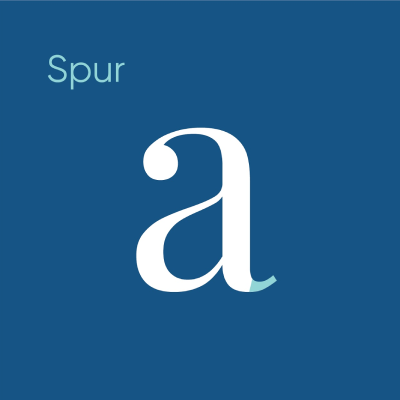
Spur - The small projection from the stem resembling the 90s funk hairstyle is called as spur.
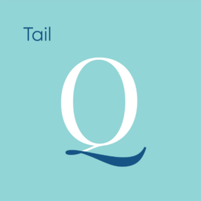
Tail - The decorative descender that is found only in uppercase and lowercase character q is called as tail.
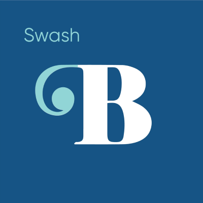
Swash - The decorative projecting stroke from the serif in some decorative typefaces is called as swash.
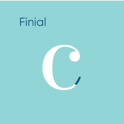
Finial - The upturning curved tapered end in some lowercase characters such as c, e and t is called as finial.
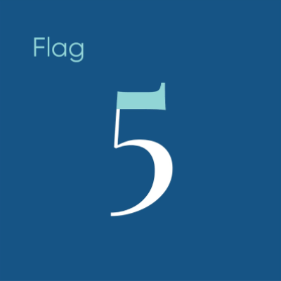
Flag - The decorative horizontal stroke that appears on the top of some numerals such as 3, 5 and 7 is called as flag.
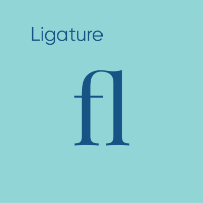
Ligature - If two or more letters combine to form a single glyph then that is called as Ligature.
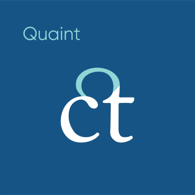
Quaint - The curved part that connects the two or more characters in a ligature is called as Quaint.
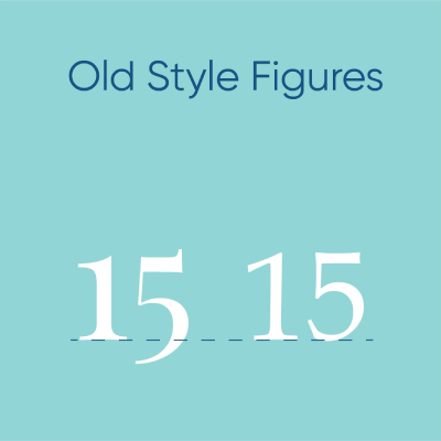
Old Style Figures - In some typefaces the numerals come below the baseline unlike the modern typefaces. These typefaces are called as Old style figures.
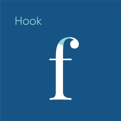
Hook - The curved part extending into the serif in lowercase character f looking like an umbrella handle is called as hook.
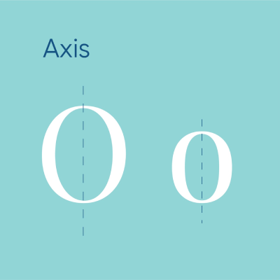
Axis - The invisible vertical or diagonal line that divides both uppercase and lowercase O into two equal symmetrical halves is called as axis.
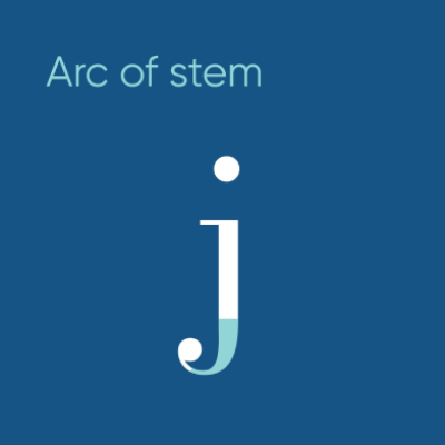
Arc of Stem - Same as hook but if it appears in the descender section then it is called as arc of stem.
Conclusion
Anatomy of typeface is critical knowledge that designers should possess because once a designer knows how to deploy the minute details and nuances in these typefaces, they can not only create visually pleasing and aesthetic designs but also deeply meaningful and impactful ones. With the advancements in technology, there is an even greater push and expectation towards the christened limits of legibility, expression, and visual communication. By learning these very inconspicuous things, one will be unlocking a great many opportunities from type-creating wonderful and remarkable visual communication. Type anatomy is the DNA of visual communication. If you're ready to move beyond the basics and start building a professional portfolio, explore our Graphic Design Curriculum to see how these fundamentals turn into a career.